Elevating user experience and storytelling on the rhombus website
Integration Marketplace
One of Rhombus' main differentiators is its open API and exceptional integration partners. Engineering Leadership wanted to convert the Integration webpage into a Marketplace.
Problem
The Integrations webpage only listed partner names without additional information. We needed a way to highlight these partnerships and simplify the process of searching and understanding them.
Outcome
A fully functional Marketplace where users can sort and filter integrations. The new design increased user engagement by 44% and the engineering team has reported receiving more integration-specific inquiries, indicating that users are better informed.


Read Case Study
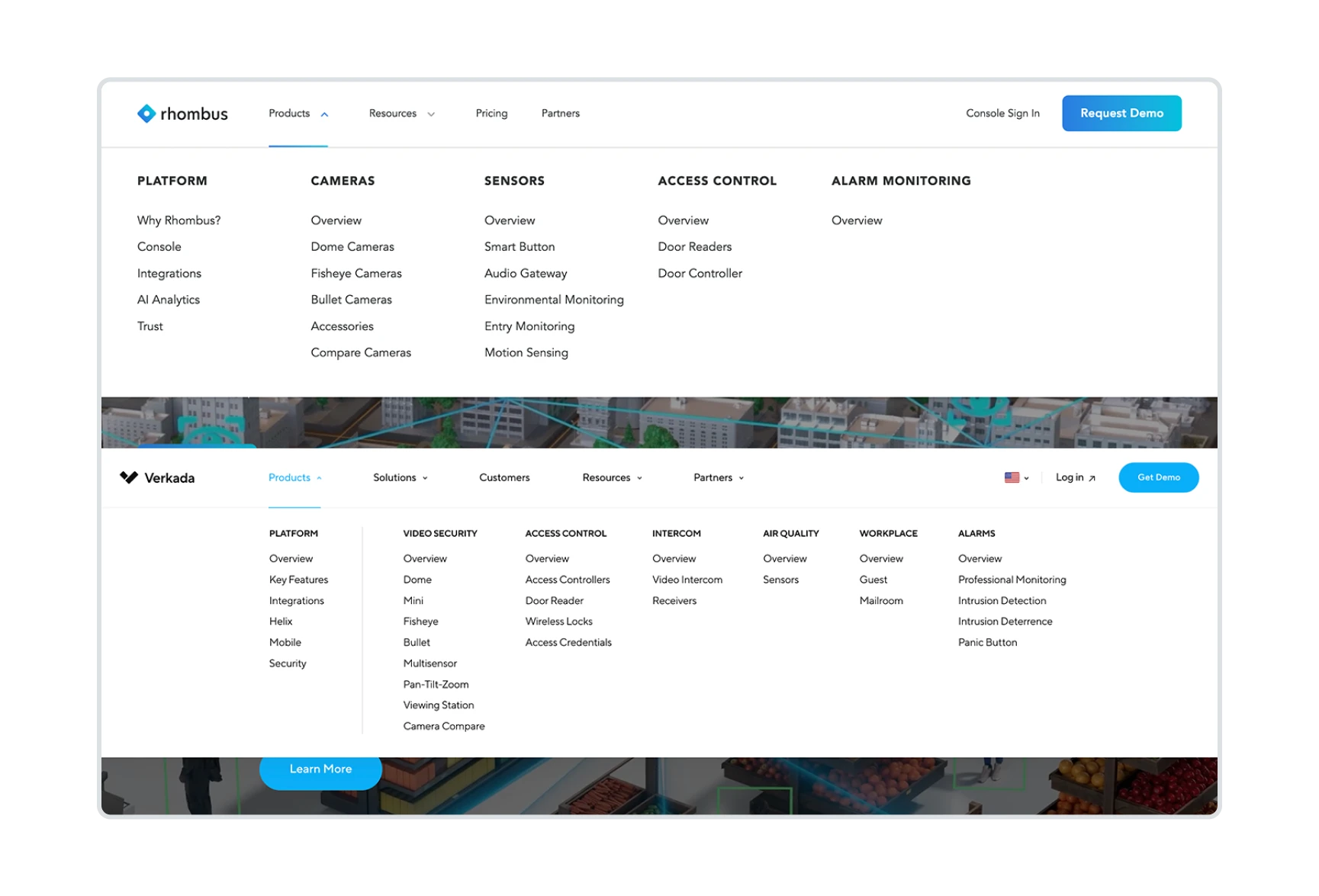
Navbar redesign
Rhombus underwent a profound website redesign to reflect its leader status in the industry and ensure seamless access to its products and services.
Problem
Users found the navbar overwhelming and too similar to our main competitor. Sales and Marketing teams wanted to bring more traffic to pages that were often overlooked by customers.
Outcome
Usability testing showed that 100% of users preferred the new design over the previous one. Featured sections and link tags successfully boosted traffic to desired pages by over 50%.

Read Case Study
Comparing Cameras
On the Compare Cameras page, users can select up to 3 products and compare their features.
Problem
The original design was clunky. Users had to select a camera in a carousel and then scroll down to view its specs, often losing track of which model they were comparing.
Outcome
I introduced a dropdown menu, allowing users to easily select and switch between cameras without losing context. The new sticky design improves navigation, reduces friction, and ensures a seamless experience for users evaluating our products.


Improving Dead Pages
Rhombus had several dead-end pages with no links or clear next steps, causing visitors to drop off. One key example was the Thank You page, which appeared after a conversion—precisely when user interest was at its peak.
Problem
These pages created a hard stop in the user flow, giving visitors no reason to stay engaged. Without additional information or calls to action, most users either closed the tab or hit the back button.
Outcome
I created pages that are visually engaging and strategically linked to relevant content, keeping users engaged with Rhombus.
For the Thank You page, we introduced friendly, informative copy that set expectations on next steps, ensuring a smoother post-conversion experience.


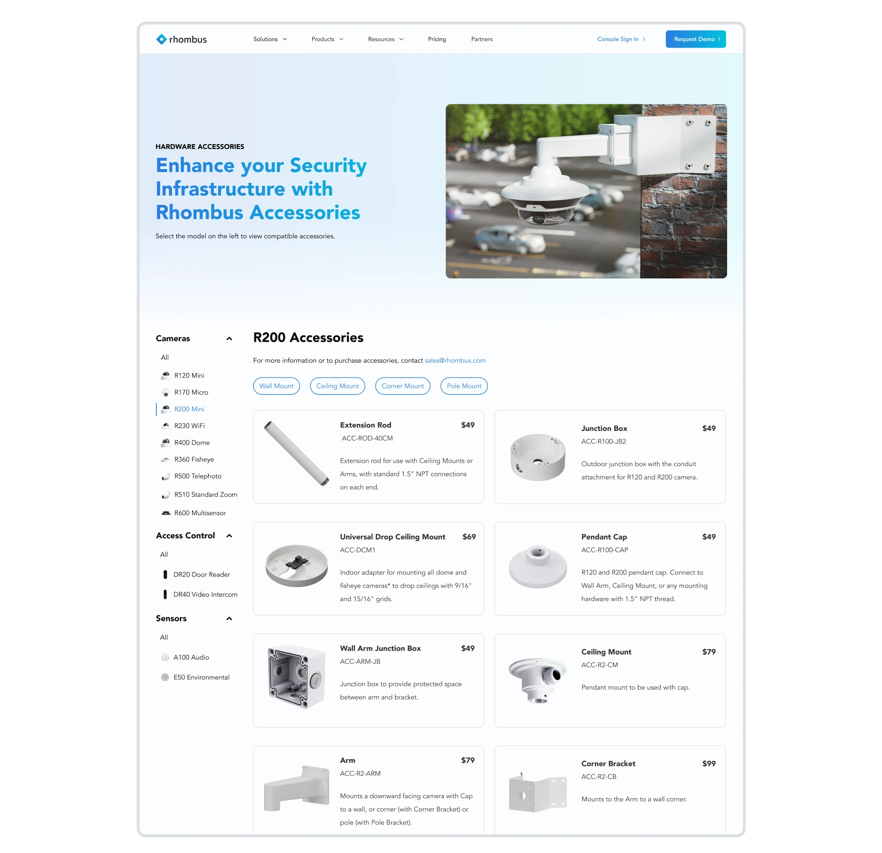
Hardware Accessories Page
The Hardware Accessories page initially focused only on camera accessories. With the addition of sensor and access control accessories, the page layout became clunky and less scalable.
Problem
Product images occupied prime space at the top, forcing users to scroll extensively to find accessories. Switching models and categories was cumbersome, requiring users to scroll back to the top to select a different product.
Outcome
I introduced a side menu that allowed users to easily switch between models and categories. I also redesigned the product cards to make accessory images more prominent and balanced, improving the user experience.