Evolving the Rhombus brand for a more strategic future
This is an ongoing project. Check back soon for updates!
Problem
Overlooked differentiators
The existing visual identity didn’t reflect Rhombus’s maturity or commitment to security, privacy, and reliability. It also didn't effectively highlight Rhombus’s strongest differentiator: exceptional customer service and real-world use cases.
Too similar to competitors
Branding relied heavily on blue, making it visually similar to most competitors in the physical security space.
Lack of hierarchy and focus
With too many shades of blue and colorful elements, inconsistent visuals, limited contrast, and hierarchy, the website felt unprofessional, unfocused, and cluttered.
Recent logo redesign
We needed to elevate our branding without changing our recently redesigned 2022 logo or straying too far from our established identity. We also wanted to avoid a complete overhaul of existing imagery and product renders.

Our Approach
Expanded color palette and improved visual hierarchy
We introduced deeper teal tones to replace the previous light blue backgrounds, adding contrast, visual depth, and a more professional tone across key web pages. This shift not only set us apart from competitors (who largely rely on brighter blue palettes) but also provided a stronger, more cohesive backdrop for our logo and product podium renders. To preserve impact and consistency, we reserved Rhombus’s signature gradient blue exclusively for the logo and selected highlights.

Customer-focused storytelling
We prioritized stock photography showing real-life usage. We also integrated more customer testimonials, ROI metrics, and impact stats to build trust and show clear business value.

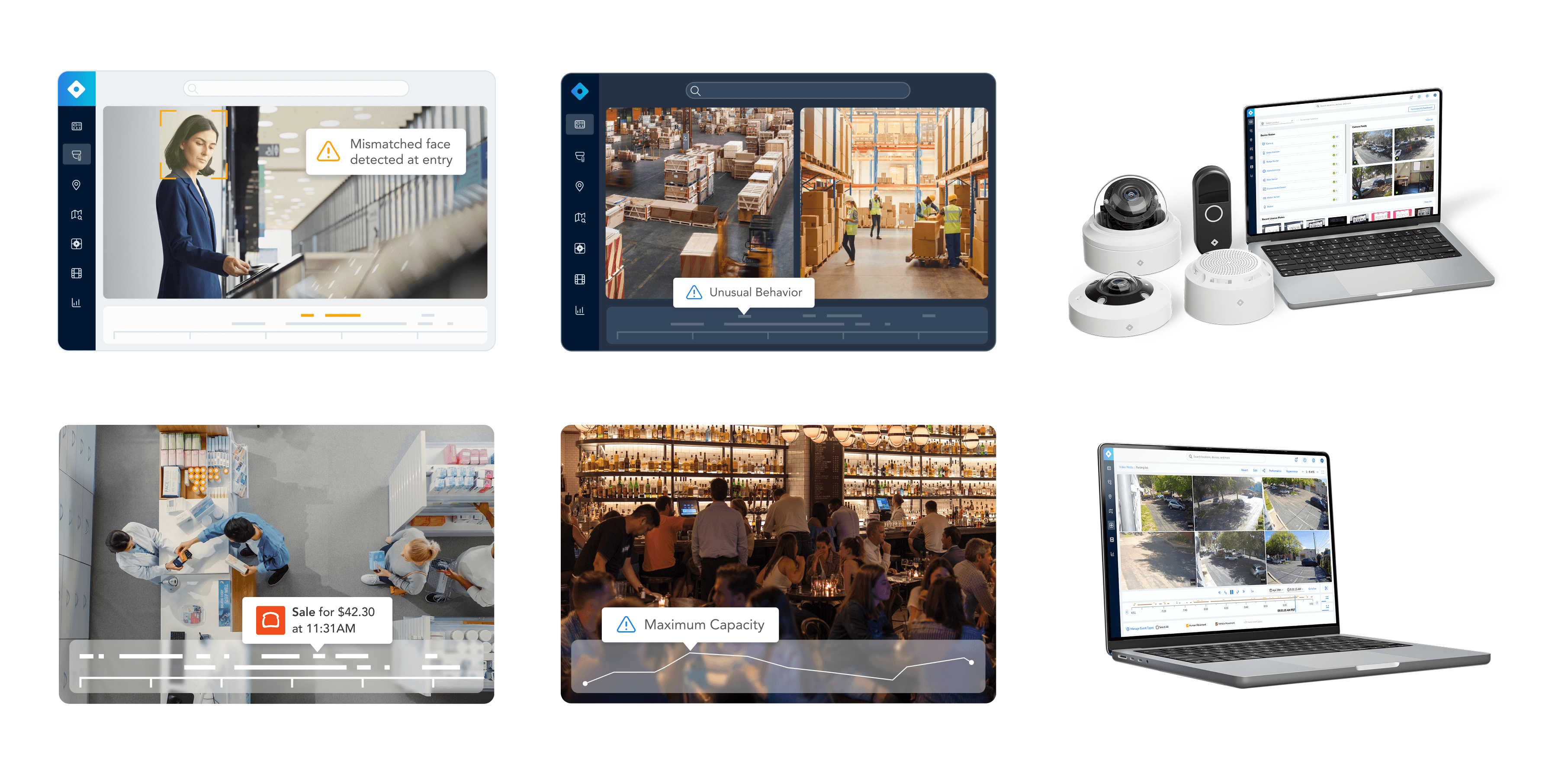
Imagery refresh
Updated console imagery and product mocks to reduce visual clutter and draw attention to core features and alerts.
Typography & iconography overhaul
Switched to Sora for headers, a typeface that feels modern, technical, and approachable, striking a balance between trustworthy and innovative. We also introduced more sophisticated and tech-forward icons to convey expertise and precision.

Outcome
Results
Though early in implementation, we’ve already seen a slight increase in click-through rate and no drop in website traffic. These are promising signs that the refreshed branding is resonating without disrupting user behavior.
Next steps
We’re currently rolling out the updated design system across the entire site and marketing ecosystem, building a more cohesive, strategic, and recognizable Rhombus brand that better reflects our commitment to customer satisfaction, innovation, and security.